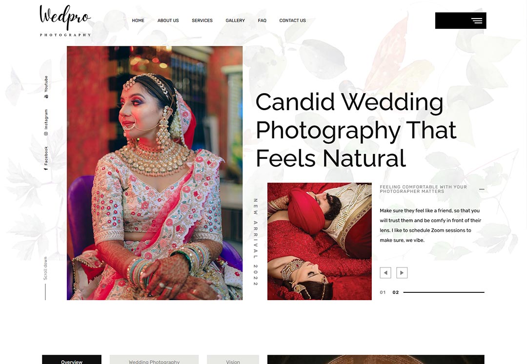
Case Study: Website Design for WedPro Photography
Client Overview
Client Name: WedPro Photography
Industry: Photography and Videography Services
Services Provided: Wedding Photography, Corporate Events, Pre-Wedding
Shoots, Maternity Photography, Portraits, and other event-based photography services.
Bersache is a renowned footwear brand known for its wide range of stylish, comfortable,
and affordable shoes. With a vision to cater to a diverse audience, Bersache has
consistently delivered quality products across various categories such as casual shoes,
sports shoes, sandals, and more. Their commitment to innovation and customer
satisfaction has made them a growing name in the footwear industry.
Project Objective
WedPro Photography required a website that could showcase their portfolio in an
aesthetically pleasing manner while also being easy to navigate and optimized for
mobile. Their goal was to attract more potential clients and improve their online
presence by having a visually striking, functional website that reflected the quality of
their work. They needed a user-friendly site that would allow potential clients to
easily view services, access portfolios, and initiate inquiries.
Challenges
- Visual Presentation: Being a photography business, the website needed to have
a highly visual appeal. The design required a balance between high-quality image
display and fast load times.
- Portfolio Management: The client needed an easy way to update and categorize
their portfolio to display various types of work.
- Responsive Design: Ensuring the site was accessible and visually appealing on
all devices, including mobile phones and tablets.
- Lead Generation: The site required clear CTAs (Call-to-Actions) for potential
clients to get in touch, along with integration options for booking appointments and
inquiries.
- SEO Optimization: The site needed to be search-engine friendly to enhance
visibility and drive organic traffic.
Solution Approach
- Design Concept and Theme Selection: We chose a minimalistic yet elegant
design that would let the images take center stage. Using a white and soft pastel
color scheme with ample negative space helped create a clean and professional look,
highlighting the vibrant visuals.
- Customized Portfolio Display: We implemented a portfolio section with
separate galleries for each photography category (e.g., weddings, corporate events,
maternity). This organization made it easy for visitors to find specific examples of
work relevant to their needs. Each portfolio image was optimized for quick loading
without compromising quality.
- Responsive and Adaptive Design: The website was designed to be fully
responsive, with layout adjustments based on screen size. This adaptability ensures
that images, text, and navigation remain clear and accessible, whether on desktop,
tablet, or mobile.
- SEO and Content Strategy: We optimized the website for search engines by
including relevant keywords, optimizing image tags, and implementing structured data
markup. Meta descriptions, alt texts, and keyword-rich headings were used to enhance
the visibility of WedPro Photography’s services in local and organic searches.
Lead Generation Tools:
- Contact Forms and CTA Buttons: Clear and compelling CTAs, such as "Book a
Consultation" and "View Portfolio," were strategically placed throughout the site to
encourage user engagement.
- Online Inquiry Forms: Custom forms for clients to inquire about services, ask
questions, and provide details about their event requirements.
- Integration with Social Media: Direct links to social media platforms helped
drive engagement and gave visitors access to additional examples of the client’s
work.
- Improved Mobile Experience: Bersache’s online presence strengthened,
resulting in better engagement with potential customers and a 20% increase in
returning visitors.
Key Features Implemented
Dynamic Image Sliders on the homepage to highlight the best work.
Portfolio with Categorized Galleries for easy navigation.
Mobile Optimization to ensure a seamless user experience across devices.
SEO Optimizations for better ranking on search engines.
Blog Section to share tips, event stories, and industry insights.
Testimonials and Client Reviews to build credibility and trust among visitors.
Results
- Increased Engagement: The new website's visually appealing and user-friendly
design led to a 35% increase in page views and a 40% increase in time spent on site
within the first two months.
- Improved Lead Generation: With clear CTAs and an easy-to-use inquiry form,
WedPro Photography saw a 50% increase in inquiries within the first quarter after
launch.
- Enhanced Mobile Experience: Over 60% of traffic came from mobile devices, and
bounce rates on mobile dropped by 25%, thanks to the responsive design.
- Higher Search Rankings: With SEO enhancements, the website saw significant
improvement in organic traffic, climbing to the top 5 positions for local
photography-related search terms.
Conclusion
The newly designed website for WedPro Photography successfully met all the client’s
objectives. The visually captivating design, coupled with user-friendly features,
has helped WedPro Photography stand out in a competitive market. By ensuring a
strong emphasis on responsive design and SEO, the website is now an effective tool
for attracting new clients and growing the business.
Future Recommendations
- Regular Portfolio Updates: Continue updating the portfolio to reflect
recent work and keep content fresh.
- Blogging for SEO: Post more content about photography trends, client
stories, and tips to further boost search engine visibility.
- Integration with CRM: Integrate the website with a CRM system to
streamline lead management and follow-up.
This project highlights the importance of aligning website design with brand
aesthetics and user expectations, and it exemplifies how a well-designed website can
serve as a powerful asset for business growth.


