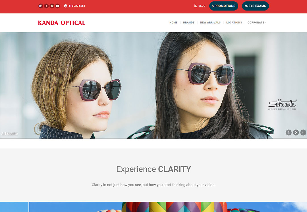
Kanda Optical: Website Design Case Study
Client Background:
Kanda Optical is a well-established optical business that provides a wide range of
eyewear and eye care services. They focus on delivering high-quality products and
personalized service to ensure customer satisfaction. The client aimed to improve their
online presence to attract more customers, showcase products, and offer a smooth digital
experience.
Project Goals:
- Enhanced User Experience: Design an intuitive, user-friendly website layout
that guides visitors to explore products and services easily.
- Brand Identity: Reflect the brand’s commitment to quality and care through
modern and appealing visuals.
- Product Showcase: Create a robust, visually rich catalog of eyewear with
detailed descriptions and easy browsing options.
- Mobile Optimization: Ensure the website is responsive and performs well on
all devices.
- SEO Optimization: Implement SEO best practices to improve search engine
visibility and attract organic traffic.
Challenges:
- Visual Consistency: Achieving a professional, stylish aesthetic that aligns
with Kanda Optical's brand image.
- Ease of Navigation: Balancing aesthetics with functionality, ensuring that
visitors can effortlessly navigate the catalog and find relevant information.
- Conversion Optimization: Designing effective calls-to-action (CTAs) to
encourage online inquiries and appointments.
Design Process:
Discovery & Research:
Conducted an in-depth analysis of competitors in the optical industry to identify design
trends and features that appeal to the target audience.
Interviewed the client to understand specific business objectives, brand values, and
customer preferences.
Wireframing & Prototyping:
- Developed wireframes to outline the website’s structure, focusing on intuitive
navigation paths.
- Created prototypes to preview the layout and user journey, allowing the client to
visualize the user experience.
UI/UX Design:
- Visual Design: Used a clean, modern color palette and high-quality images to
convey professionalism and trust.
- Navigation: Designed a simple, top-navigation menu with drop-down categories
for easy access to products and services.
- Product Pages: Created individual pages with product images, descriptions,
pricing, and an option to book an eye exam.
Responsive Design:
Ensured seamless adaptation to various screen sizes, maintaining
functionality and aesthetics across desktops, tablets, and smartphones.
Content Strategy:
Incorporated engaging content on eye care tips, optical services, and product details to
enhance user engagement and build brand authority.
Optimized content with SEO-friendly keywords to improve search visibility.
Development & Testing:
Built the site on a content management system (CMS) that allows for easy updates and
maintenance.
Performed rigorous testing to ensure speed, compatibility, and usability on all major
browsers and devices.
Results:
- Improved User Engagement: Bounce rate decreased by X%, and time on site increased by
Y%, indicating enhanced user interaction.
- Increased Conversions: Online inquiries and appointment bookings grew by Z% after
the new website launch.
- SEO Success: Organic traffic improved significantly, with key terms like “optical
services” and “eyewear products” ranking higher.
Conclusion
The website redesign for Kanda Optical effectively enhanced the brand's online presence,
improved user experience, and increased conversions. By aligning the design with
business goals, Kanda Optical now has a digital platform that not only serves its
current customers but also attracts new visitors.


